
TL;DR
Mobile shopping is growing rapidly on Amazon, making it essential to create Enhanced Brand Content (EBC) that works well on both mobile and desktop devices.
Clear images, concise text, and simple layouts help ensure your EBC looks professional and easy to navigate across different screen sizes.
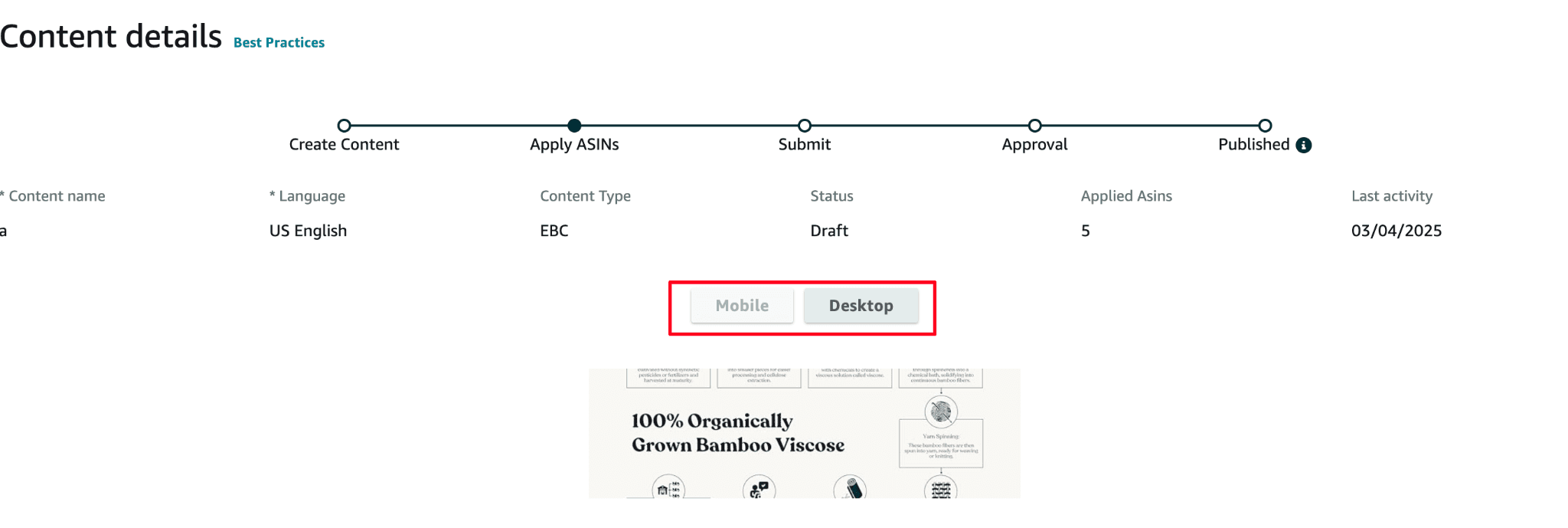
Test your EBC on multiple devices before publishing to catch formatting issues and ensure all elements display properly.
Choose Amazon-approved modules that adapt well to various screen sizes, such as single images with highlights or vertically stacking text and images.
Avoid common design mistakes like overcrowded layouts, overly long text, and untested formatting, as these can drive shoppers away.
Did you know that more than 70% of Amazon shoppers use their smartphones to browse and shop? With mobile shopping becoming so common, your product pages need to look good and work well on both phones and desktop screens. Enhanced Brand Content (EBC) is one of the best ways to stand out, but if it doesn’t look right on mobile devices, you could be losing potential buyers.
Many sellers only focus on how EBC appears on desktops, only to find that their images and text don’t display correctly on mobile. When content looks cluttered or gets cut off on a phone screen, customers may leave without buying.
That’s why creating EBC that works on both mobile and desktop is so important. When your content looks great on all screen sizes, your brand message stays clear, easy to understand, and professional. In this guide, we’ll look at why mobile-friendly EBC matters, how to design content that works across devices, and which modules can help ensure the best performance.
The growing importance of mobile shopping on Amazon
The Amazon UK mobile app consistently ranks as one of the most popular shopping apps, with millions of downloads and active users. A large share of UK shoppers make their Prime Day purchases via smartphones, reflecting the increasing role of mobile in the region’s major sales events. Mobile traffic accounts for well over half of all visits to Amazon’s UK website, underscoring the importance of mobile-friendly content.
More than half of Amazon UK product searches are conducted on mobile devices, highlighting the need for an Amazon listing optimisation for mobile shoppers. This shift is happening because it’s more convenient. With a phone, customers can compare products, read reviews, and make purchases anytime, anywhere. If your product pages aren’t mobile-friendly, you risk losing these shoppers.
Mobile buyers also tend to make quick decisions. They might see an ad or get a promotional email, then go straight to the Amazon app or website. If your product images don’t display correctly or your descriptions are hard to read, these customers will likely move on to another seller.
As mobile shopping continues to grow, it’s more important than ever to ensure your Amazon listings look good and are easy to use on a phone. This helps you reach more customers and stay ahead of the competition.
Why EBC needs to be optimized for both mobile and desktop
Enhanced Brand Content (EBC) is a powerful tool for engaging Amazon shoppers, but it must be optimized for both mobile and desktop platforms to truly succeed. With over half of Amazon shoppers now browsing and buying on mobile devices, failing to create EBC that looks great on smaller screens means losing out on a huge segment of potential customers.
Mobile shoppers tend to make quick buying decisions, and cluttered or poorly formatted content can drive them away. On the other hand, desktop shoppers often take more time to read through details and compare products, meaning that a professional, well-organized layout can greatly improve conversion rates.
By designing EBC that works seamlessly on both platforms, you can ensure that your brand message remains clear and persuasive no matter where customers shop. This approach not only enhances the customer experience but also boosts trust, conversion rates, and sales on Amazon.
How to design Amazon EBC that looks great on phones and computers
Designing Amazon Enhanced Brand Content (EBC) that performs well on both mobile and desktop screens requires a thoughtful, flexible approach. Shoppers frequently switch between devices, so your content must be easy to read, visually appealing, and consistent across all screen sizes.
Start with clear, high-quality lifestyle photography. Visuals are a central element of EBC, and they must look crisp and load quickly on any device. Avoid overly intricate layouts or images with fine details that might become unclear on a mobile screen. Use Amazon’s recommended image dimensions to maintain quality and ensure images are correctly cropped and scaled.
When writing copy, focus on short, impactful sentences and bullet points. On mobile devices, long paragraphs can become overwhelming and may lead shoppers to abandon the page. Instead, keep your text concise, ensuring that each piece of information is immediately visible without extensive scrolling.
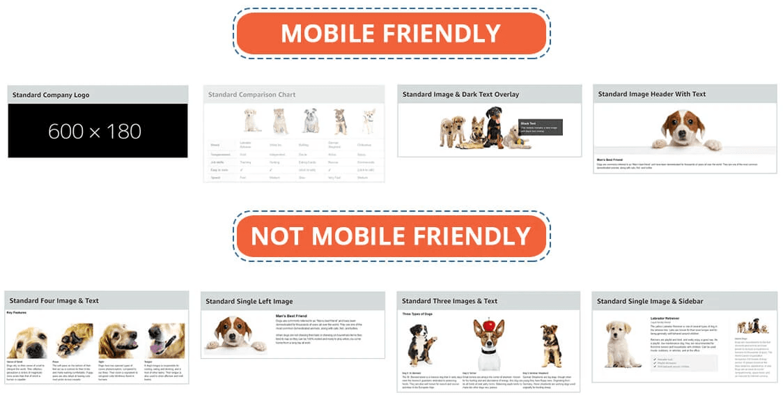
Select EBC modules that adapt well to smaller screens. Certain modules, such as side-by-side comparison charts, may not display as intended on mobile. Opt for modules that stack vertically or rely on a single, central image to ensure consistency and readability.
Finally, test your EBC on multiple devices before publishing. View your product pages on different smartphones, tablets, and desktop browsers to catch formatting issues. Adjust spacing, image alignment, or text layout as needed to provide a seamless experience.
By prioritizing clarity, consistency, and responsiveness, you can create EBC that looks great on both phones and computers, ensuring a strong customer experience on any device.
Mobile vs desktop: Create EBC that fits all screen sizes
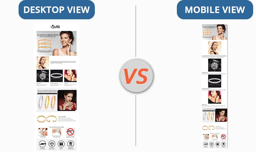
Today, people shop on Amazon using all kinds of devices, from large desktop computers to small smartphones. That means your Enhanced Brand Content (EBC) should look good on every screen size. If it only works well on one type of device, you might lose customers shopping on the other.
To make Amazon EBC fit all screens, choose simple layouts that can adjust to different sizes. For example, stack content vertically so it looks clean on mobile phones, while still appearing professional on desktops.
Use clear, high-quality images and follow Amazon’s guidelines for image dimensions. This helps your pictures stay sharp on all devices. Keep your text short and easy to read. Simple bullet points and concise headings are better than long paragraphs that are hard to scroll through on small screens.
Before you publish, always check how your EBC looks on both mobile and desktop devices. Make sure text aligns properly, images look good, and everything is easy to read. By doing this, you’ll create EBC that’s user-friendly on any device, helping you build trust and improve sales.
Best EBC modules for cross-device performance
When choosing EBC modules, it’s important to select ones that perform well on both mobile and desktop devices. Some modules naturally adapt better to various screen sizes, ensuring that your content looks professional and user-friendly no matter where shoppers view it.
Single image with highlights
This module places a large, clear image at the top of your content, with concise text highlights beneath. It scales down well on mobile while still providing enough detail for desktop viewers.
Comparison chart
While side-by-side comparisons can be tricky on smaller screens, many Amazon-approved comparison modules automatically stack vertically on mobile. This makes it easy for shoppers to scroll and understand key differences at a glance.
Text-only module or small image
Modules with short paragraphs or text paired with small images maintain clarity on mobile without overwhelming desktop layouts. These can convey product benefits quickly, regardless of screen size.
Lifestyle image with overlay text:
Amazon Lifestyle product photography helps showcase your product in real-world use. Overlay text can emphasize key features without adding bulky paragraphs, keeping the design sleek and readable on any device.
Technical details module:
For complex products, a technical specs module is helpful. Ensure that the table format or bullet points shift neatly for mobile viewing, preventing crowding or confusion.
By prioritizing flexible modules that stack or resize gracefully, you can create EBC that delivers a consistent, high-quality shopping experience across all devices.
Common EBC design mistakes across devices
Overcrowded layouts: Packing too much content into one section can make EBC appear cluttered and hard to read, especially on mobile screens.
Using text that’s too long: Lengthy paragraphs may look fine on desktops but become overwhelming on smaller screens. Shoppers are more likely to skip content they can’t quickly scan.
Relying on images that don’t resize well: Images designed exclusively for desktop can lose clarity or appear awkwardly cropped on mobile devices. If they don’t scale properly, the user experience suffers.
Overlooking font size and readability: Small fonts or poor color contrast can make text difficult to read on mobile screens, driving shoppers away before they understand your product’s value.
Not testing on multiple devices: Assuming your EBC looks fine without previewing it on both mobile and desktop is a common mistake. Without testing, you might miss formatting issues or alignment problems.
Lack of vertical stacking on mobile: Some EBC modules are not ideal for mobile viewing, as they fail to stack content vertically. This can lead to awkward gaps or misaligned elements that confuse shoppers.
By avoiding these design mistakes, you can create EBC that works well on all devices and provides a smoother, more engaging shopping experience. Here, you can also choose Amazon enhanced brand content design service that helps you to improve your visibility and sales.
Final words
Creating Amazon Enhanced Brand Content (EBC) that works seamlessly on both mobile and desktop devices is essential for engaging today’s cross-device shoppers. With mobile browsing becoming increasingly common, your content must be versatile and accessible on smaller screens.
By incorporating adaptable layouts, sharp visuals, and concise text, you’ll enhance readability and maintain a professional, engaging appearance no matter what device your customers use. To achieve this, it’s important to test your EBC on multiple platforms and address common pitfalls—like cluttered layouts or images that don’t resize well—before they affect the user experience.
If you’re unsure how to optimize your EBC for different screen sizes, consider consulting with our Amazon experts. We can guide you in developing user-friendly content that highlights your products effectively, strengthening your brand and driving more sales.


